六、定位
6-1、相对定位
6-1-1、基本操作
相对定位:position:relative
相对于原来的位置,进行指定的偏移,相对定位仍处在标准文档流中,原来的位置会被保留
top、left、bottom、right
<!DOCTYPE html><html lang="en"><head>
    <meta charset="UTF-8">
    <title>Title</title>
    <!--相对定位
    相对于自己原来的位置进行偏移
    -->
    <style>
        div{
            margin: 10px;
            padding: 5px;
            font-size: 12px;
            line-height: 25px;
        }
        #father{
            border: 1px solid red;
        }
        #first{
            border: 1px dashed orange;
            background-color: #FFFFFF;
            background-image: linear-gradient(339deg, #FFFFFF 0%, #6284FF 50%, #FF0000 100%);
            position: relative;/*相对定位:上下左右*/
            top: -20px;
            left: 50px;

        }
        #second{
            border: 1px dashed green;
            background-color: #D9AFD9;
            background-image: linear-gradient(298deg, #D9AFD9 0%, #97D9E1 100%);

        }
        #third{
            border: 1px dashed cornflowerblue;
            background-color: #FFE53B;
            background-image: linear-gradient(270deg, #FFE53B 0%, #FF2525 74%);
            position: relative;
            bottom: 10px;
        }
    </style></head><body><div id="father">
    <div id="first">第一个盒子</div>
    <div id="second">第二个盒子</div>
    <div id="third">第三个盒子</div></div></body></html>
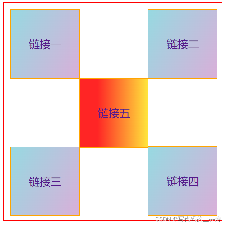
6-1-2、方块定位
<!DOCTYPE html><html lang="en"><head>
    <meta charset="UTF-8">
    <title>Title</title>
    <style>
       #box{
           border: 1px solid red;
           width: 300px;
           height: 300px;
            padding: 10px;
       }
       .first{
           border: 1px solid orange;
           position: relative;
       }

        .second{
            border: 1px solid orange;
            position: relative;
            left: 202px;
            bottom: 102px;
        }
        .third{
            border: 1px solid orange;
            position: relative;
            bottom: 2px;
        }
        .forth{
            border: 1px solid orange;
            position: relative;
            left: 202px;
            bottom: 104px;
        }
        .fifth{
            border: 1px solid orange;
            position: relative;
            left: 101px;
            bottom: 306px;
        }

        a{
            width: 100px;
            height: 100px;
            text-decoration: none;
            line-height: 100px;
            text-align: center;
            background-color: #D9AFD9;
            background-image: linear-gradient(298deg, #D9AFD9 0%, #97D9E1 100%);
            display: block;
        }
        a:hover{
            background-color: #FFE53B;
            background-image: linear-gradient(270deg, #FFE53B 0%, #FF2525 74%);
        }
    </style></head><body><div id="box">
    <a href="#" class="first">链接一</a>
    <a href="#" class="second">链接二</a>
    <a href="#" class="third">链接三</a>
    <a href="#" class="forth">链接四</a>
    <a href="#" class="fifth">链接五</a></div></body></html>
6-2、绝对定位
定位:基于xxx定位,上下左右。
没有父级元素的前提下,相对于浏览器定位
假设父级元素存在定位,通常会相对父级元素进行偏移
在父级元素范围内移动
相对于父级或浏览器的位置,进行指定的偏移,绝对定位不在标准文档流中,原来的位置不会被保留
<!DOCTYPE html><html lang="en"><head>
    <meta charset="UTF-8">
    <title>Title</title>
    <style>
        div{
            margin: 10px;
            padding: 5px;
            font-size: 12px;
            line-height: 25px;
        }
        #father{
            border: 1px solid red;
            position: relative;
        }
        #first{
            border: 1px dashed orange;
            background-color: #FFFFFF;
            background-image: linear-gradient(339deg, #FFFFFF 0%, #6284FF 50%, #FF0000 100%);

        }
        #second{
            border: 1px dashed green;
            background-color: #D9AFD9;
            background-image: linear-gradient(298deg, #D9AFD9 0%, #97D9E1 100%);
            position: absolute;
            right: 30px;

        }
        #third{
            border: 1px dashed cornflowerblue;
            background-color: #FFE53B;
            background-image: linear-gradient(270deg, #FFE53B 0%, #FF2525 74%);

        }
    </style></head><body><div id="father">
    <div id="first">第一个盒子</div>
    <div id="second">第二个盒子</div>
    <div id="third">第三个盒子</div></div></body></html>
6-3、固定定位 fixed
<!DOCTYPE html><html lang="en"><head>
    <meta charset="UTF-8">
    <title>Title</title>
    <style>
        body{
            height: 1000px;
        }
        div:nth-of-type(1){
            width: 100px;
            height: 100px;
            background-color: red;
            position: absolute;
            right: 0;
            bottom: 0;
        }
        div:nth-of-type(2){
            /*fixed 固定定位*/
            width: 50px;
            height: 50px;
            background: darkolivegreen;
            position: fixed;
            right: 0;
            bottom: 0;
        }
    </style></head><body><div>first</div><div>second</div></body></html>
6-4、z-index
图层
默认是0,最高无限
<!DOCTYPE html><html lang="en"><head>
    <meta charset="UTF-8">
    <title>Title</title>
    <link rel="stylesheet" href="css/style.css"></head><body><div id="content">
    <ul>
        <li><img src="images/1.png" alt=""></li>
        <li class="tipText">天水姜伯约</li>
        <li class="tipBg"></li>
        <li>时间:2023-04-10</li>
        <li>地点:武汉</li>
    </ul></div></body></html>
透明度:opacity:0.5
#content{
    width: 500px;
    padding: 0px;
    margin: 0px;
    overflow: hidden;
    font-size: 12px;
    line-height: 25px;
    border: 1px solid red;}ul,li{
    padding: 0px;
    margin: 0px;
    list-style: none;}/*父级元素相对定位*/#content ul{
    position: relative;}.tipText, .tipBg{
    position: absolute;
    width: 250px;
    height: 25px;
    top: 125px;}.tipText{
    color:white;
    z-index: 999 ;}.tipBg{
    background: black;
    /*opacity: 0.5;*//*背景透明度*/}
     right: 0;
        bottom: 0;
    }
</style>
first
second
```
6-4、z-index
图层
默认是0,最高无限
<!DOCTYPE html><html lang="en"><head>
    <meta charset="UTF-8">
    <title>Title</title>
    <link rel="stylesheet" href="css/style.css"></head><body><div id="content">
    <ul>
        <li><img src="images/1.png" alt=""></li>
        <li class="tipText">天水姜伯约</li>
        <li class="tipBg"></li>
        <li>时间:2023-04-10</li>
        <li>地点:武汉</li>
    </ul></div></body></html>
透明度:opacity:0.5
#content{
    width: 500px;
    padding: 0px;
    margin: 0px;
    overflow: hidden;
    font-size: 12px;
    line-height: 25px;
    border: 1px solid red;}ul,li{
    padding: 0px;
    margin: 0px;
    list-style: none;}/*父级元素相对定位*/#content ul{
    position: relative;}.tipText, .tipBg{
    position: absolute;
    width: 250px;
    height: 25px;
    top: 125px;}.tipText{
    color:white;
    z-index: 999 ;}.tipBg{
    background: black;
    /*opacity: 0.5;*//*背景透明度*/}
链接:https://blog.csdn.net/clover_page/article/details/130100672
作者:姜伯約